Continuing from the previous post.

I created this diagram for Pat and I to have a visual layout of the story and how it would play out. It’s split into segments describing the flow of the action and the pacing, sort of an emotional approximation for the 2-3 minutes we had to show the fight.
With the knowledge we pulled from our anime reference, now we can use it to make our own hyper shonen anime fight! But we have to do it in 2-3 months. How do we stop ourselves from cutting too much quality or spending too much time on one part?
First, it should be important to note that in the examples I gave before, the Build-up and the Aftermath are the most complex to animate because they have more detailed movements and descriptions. So we can use this in our planning.
I created a Google Sheet that has a chart with every shot we planned in the animation:

This way, both Pat and I can view and edit the contents of the Sheet. I was also able to create the legend diagram on the left side and lock it so that neither Pat or I could move it around accidentally. Organization!
As you can see, the legend has two pieces. It has the first column, D, which denotes the completion of the shots. (Since I was the one wrapping up all of the effects at the end, it was redundant to mark them “completed” on the document, woops).
The 2nd column, E, is where we started. This has a color code for how complicated the scene would theoretically be to animate. The idea was to spread the workload around so that there were only a few High complexity scenes, a handful of Medium complexity scenes, and then everything else was Low complexity.
We worked from High to Low, that way if we ended up working down to the wire, we could cut corners and rush on the low complexity scenes and it wouldn’t be as damaging to the final product. Wouldn’t it suck if you had to rush on the climax of your entire animation?

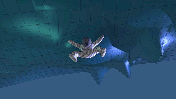
Pat drew up this storyboard for Shot 1, and then I took it into Photoshop to paint a color key. It was important for me to shade it with glows and stuff because this would help me visualize and aim for the final results when I started compositing in After Effects. It’s important to keep yourself inspired and motivated to work on the project, so taking time to do these previews is really helpful when you have to do so much repetitive work!
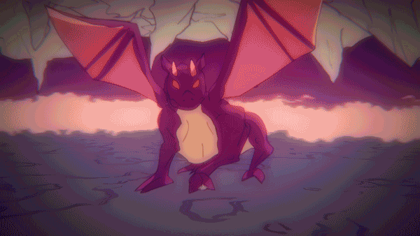
The red version is for the “2nd phase” of the animation when the dragon emerges from the lava pool. I wanted to set a tone shift where things felt more sinister, it also breaks it up from the rest of the animation so it feels more colorful and alive. You can notice a couple of things from my painting above, there is a green atmosphere around everything, like in the background. But the light source and the mist has a blue eerie glow to it. There is also a touch of vibrant purple in the background around the edges of the mist, it helps unify the colors with the characters skin which has some red highlights on the edges of shadow to simulate Subsurface Scattering. It makes the skin feel more fleshy and alive, and that vibrant pop of red becomes a bit lonely without something similar echoed in the background.

And here you can see the same shot in the final animation. Notice how the glows help all those colors pop? Having a plan from the beginning really helps in the later stages. In fact, one of the major things Pat and I focused on was having a full month of planning. Doing storyboards and rough animation only. This allowed us a lot of flexibility when things didn’t go the way we wanted to. And that happened quite a bit.
Character Design


You can see a construction lines image on the left for Bruce and Virgo. This is so Pat and I both can draw the characters with the same shapes and forms. Otherwise you could run into problems like one of us seeing Bruce’s head as more of an oval than a circle, or making the beard bigger than it is in the reference without understanding how the original artist drew the beard in proportion to the head.

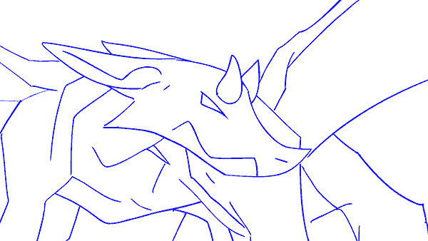
Dragon concepts, Pat messed around with different animal reference, like dog hind legs and spines. This made the dragon more unique than just being a big bulky lizard with wings.
Designing Bruce
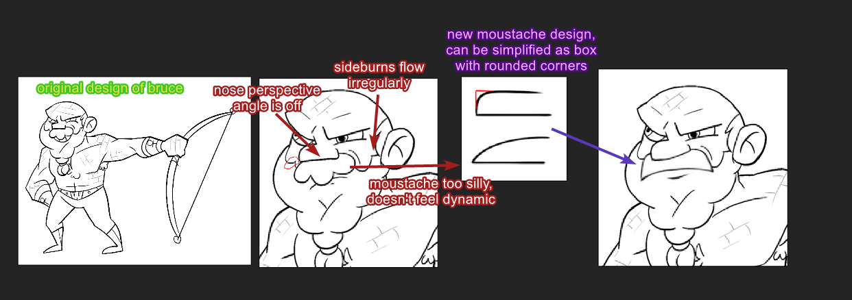
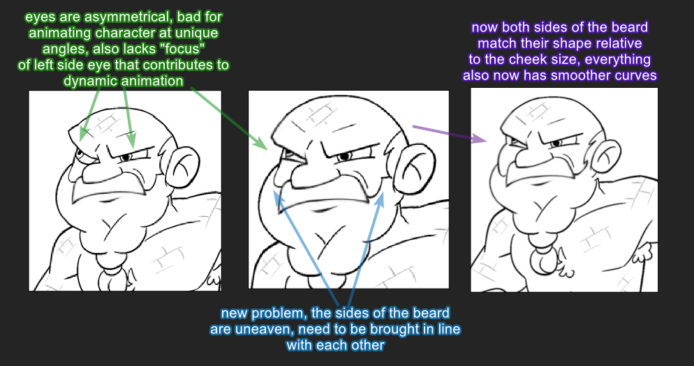
These are most of the images Pat and I shared back and forth with each other over Discord. Pat drew up the concept and I went through and made these corrections to fit more with my overall idea of the animation.
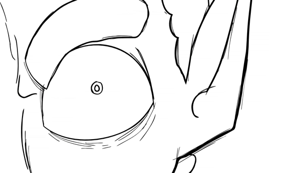
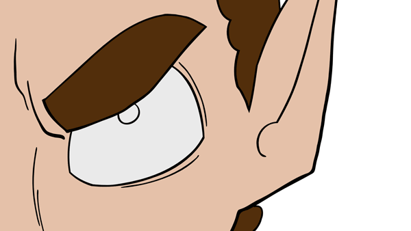
Besides style, I also went through to catch some consistency errors. Regardless of skill level, all artists can get caught up in a web of ideas and having a third party to view your work is crucial to catching some things that you are unable to see while working on a clock. The shape of the eyebrows, and the positioning and shape of the beard between the left and right side of the head needed touch ups. In hindsight, we realized we should have designed Bruce from a front view as well to solve a few issues that came from rotating some of Bruce's features.
Designing Virgo
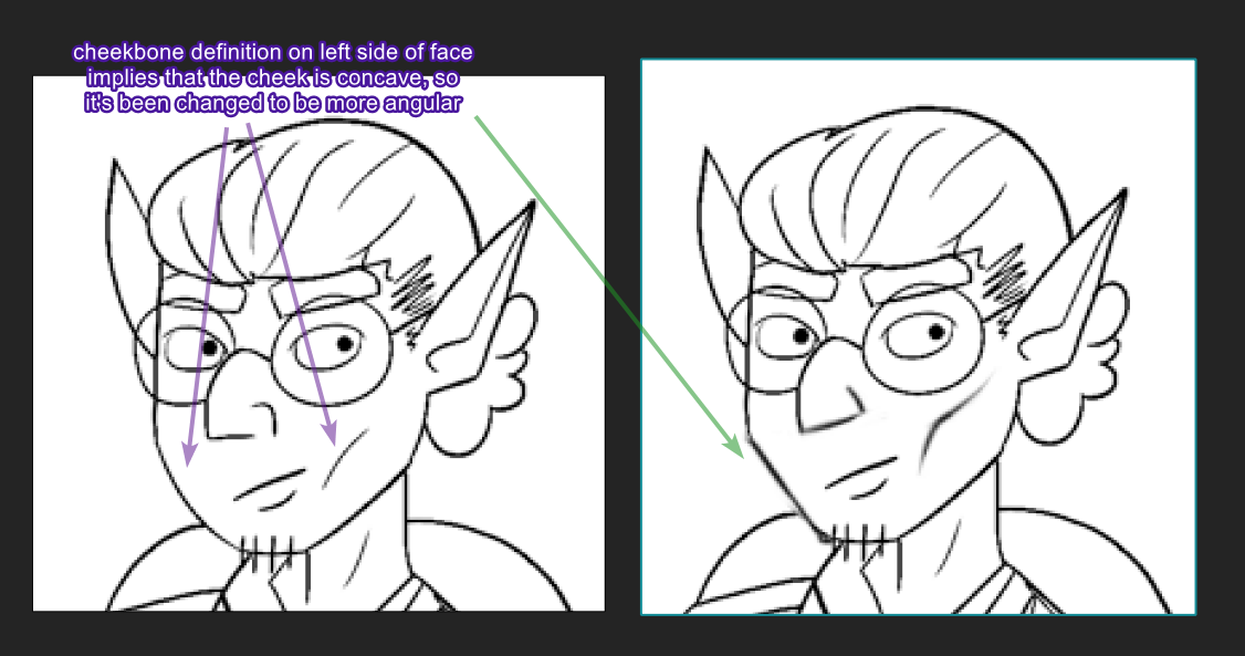
Not a lot of changes were made to Virgo’s design actually. The only one was that he had a rounded cheek on one side whereas there was a line on the opposite side implying Virgo had very pronounced cheekbones. So the cheek was made to have a straighter and more angular look, which also goes with the “dynamic” feel for the style we talked about with Bruce. His nose was also updated to be more angular, the nostril shape was removed and merged with the bottom portion to look a little sleeker.
Designing Virendra (Dragon)

Pat actually did a lot of animal anatomy research to create the dragon. Above are all of his notes. He did a lot of analysis to match the action oriented approach I wanted to take, merging the teeth with the head silhouette, and showing how the dragon would use each body part as with the emphasis on the wings being like hands, almost like a bat. We wanted a more slender body, and Pat achieved this by basing the body of the dragon on a dog. You can see this in the drawing above where the tail is curved up. I had Pat change this to be a tail that was floppier and heavier, more like a lizard tail because the curve made it a little too dog like.
Production
Pat and I had a main setup for collaborating on our animations. We used Toon Boom to animate with, and then saved our project files into a Google Drive folder that we maintained a sync with. This way changes were constantly shared between us and we could always check new changes in real time.

Toon Boom allows us to quickly color our shots, as well as providing the Cutter tool, which allows artists to draw clean lines by letting you slice off lines that overlap too much. So instead of having to create a rounded corner by drawing, stopping, and changing direction; you can simply draw two lines intersecting and use gesture flicks to slice off the parts you don’t need.
As a final note on the general production, we ran into timing issues where things didn’t last long enough. Moments would be over too quick, which when you are working frame by frame, you forget how fast the animation actually moves when you play it all together. I ended up making new animations that had quick closeups on character faces, and showing looped animations that padded the timings. Since I was in a rush, I ended up hilariously rendering them out as “0.75” and “0.5”.
